


My Design Manifesto
Experimental Typographic Posters


Experimental Typography
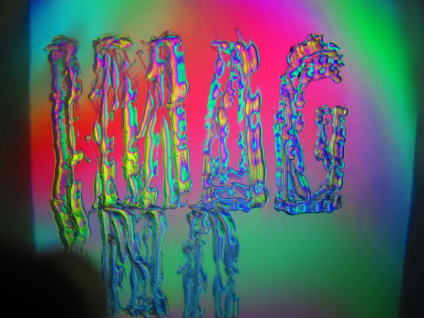
A Soldering Iron and CD Covers - Captured in Polarized Light
For the background imagery of the posters, a soldering iron was used on a plastic CD cover to spell out the important words within my manifesto. The CD covers were then placed in front of a LCD screen, and using a 3D glass lense as a polaroid filter that was placed in front of a camera lense, the polarized light that was received from the filter was then captured to reveal the remarkable coloured lighting, and the delicate textures created from the soldering iron.
Unedited Images of the polarized typography


Due to the nature and colour of the experimental typography, intricate details of typographic placement and design had to be considered in order for each element to balance itself out, to create contrast and harmony. Therefore, designing these posters proved to be quite the challenge, and so many renditions and grids had to be designed with focus on specific design elements and principles. After many attempts, the finals depict this careful consideration, which creates the perfect balance. Turquoise transparent overlays were used as an element in order to create a better contrast for the typography, while not detracting from the details in the background. A simple typeface was used (Roboto), which was designed in a way that both relayed the information effectively and complimented the backgrounds. It also interacted with the experimental typography through overlay transparencies, which exaggerated it's details. The psychedelic colours and style of the design accurately portray the personality of the manifesto - one of inspiration, originality, and that challenges the norm.


Thank You


